Mobile UI gallery
Chart views and controls at a 390 × 844 portrait phone viewport and a 930 × 840 landscape viewport sized for an unfolded foldable phone or tablet. Select an image to enlarge it.
These screenshots use Obsidian’s official mobile emulation on desktop, with fictional English sample data. Unused status-bar space is excluded. They are not physical-device screenshots.
Chart views
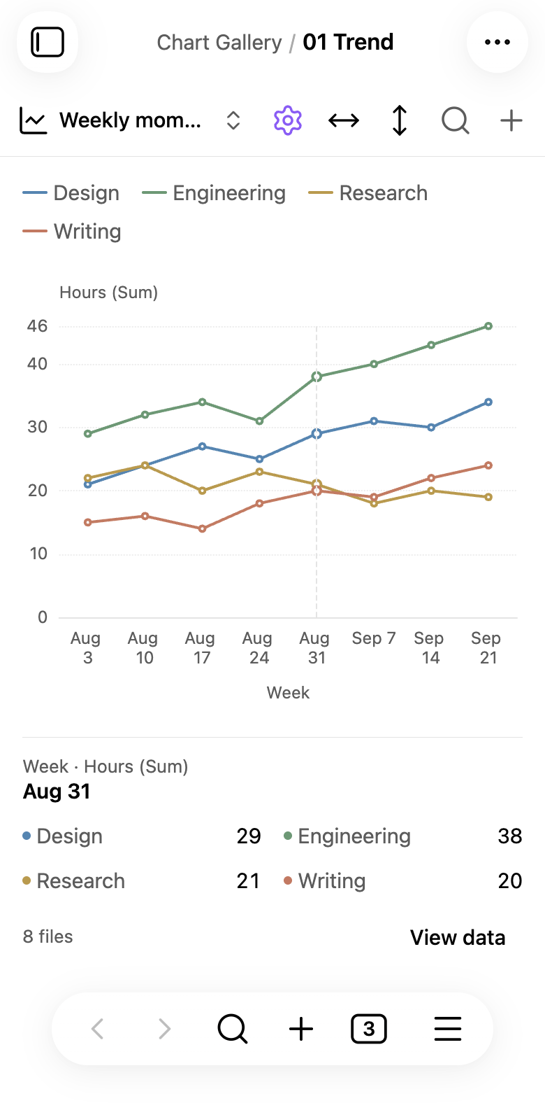
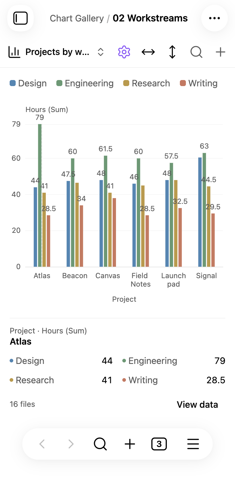
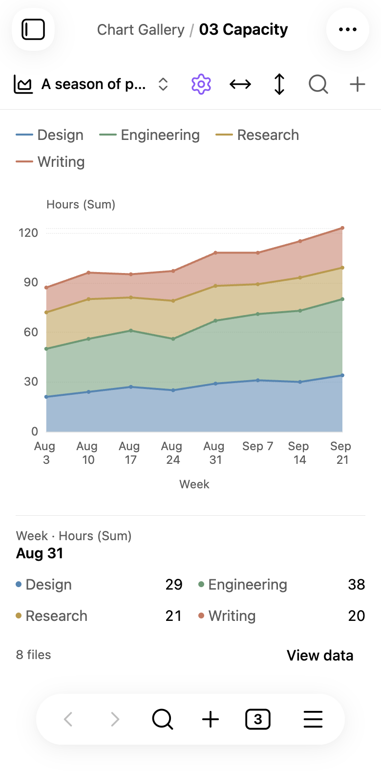
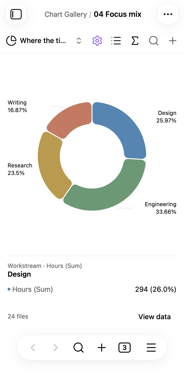
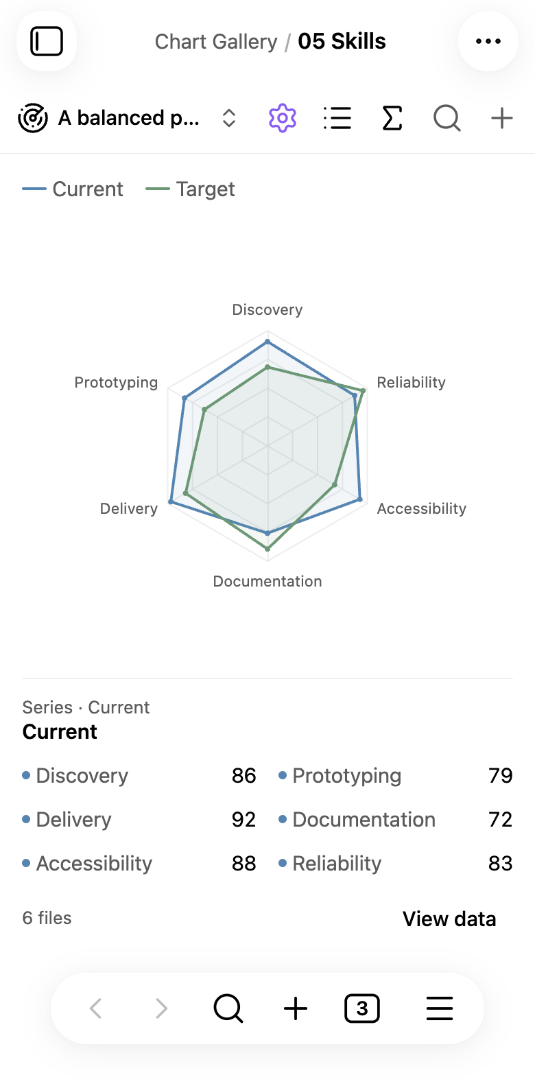
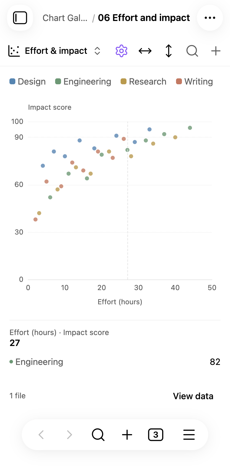
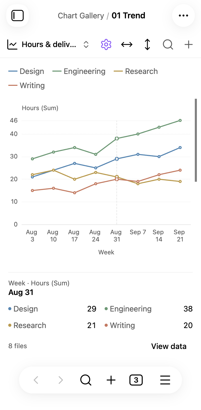
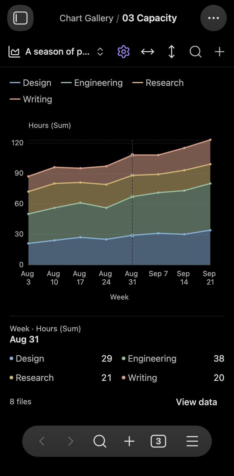
Group colors remain visible above the chart on phones. Portrait phones and foldables up to 1024 CSS pixels wide show the current selection in a fixed preview below the chart.
Touch inspection
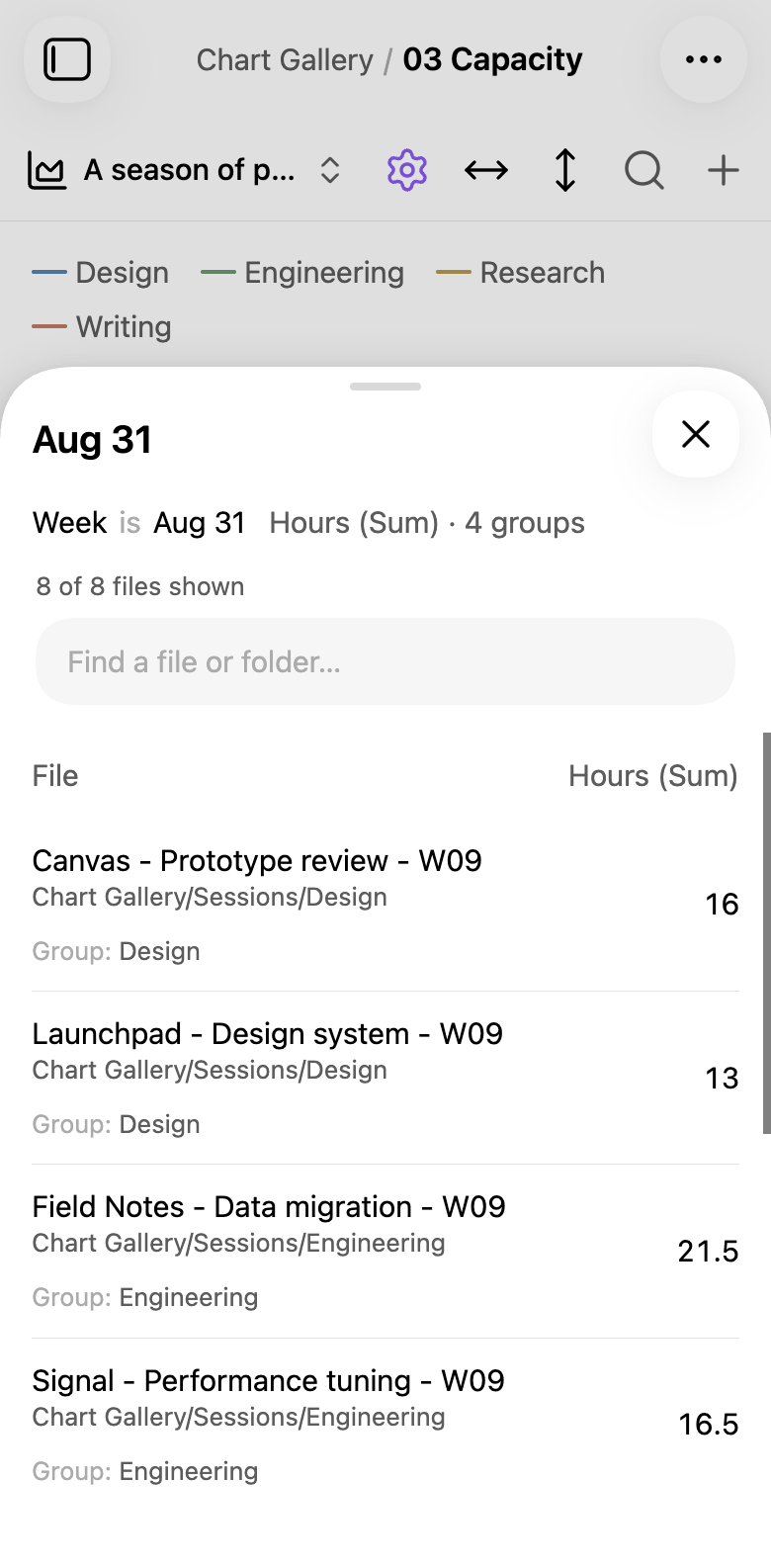
Tap a chart mark or a supported column to inspect it. Slide across the chart to change the selection; the preview stays visible after you lift your finger. View data opens the selected source files in a native drawer.
Settings
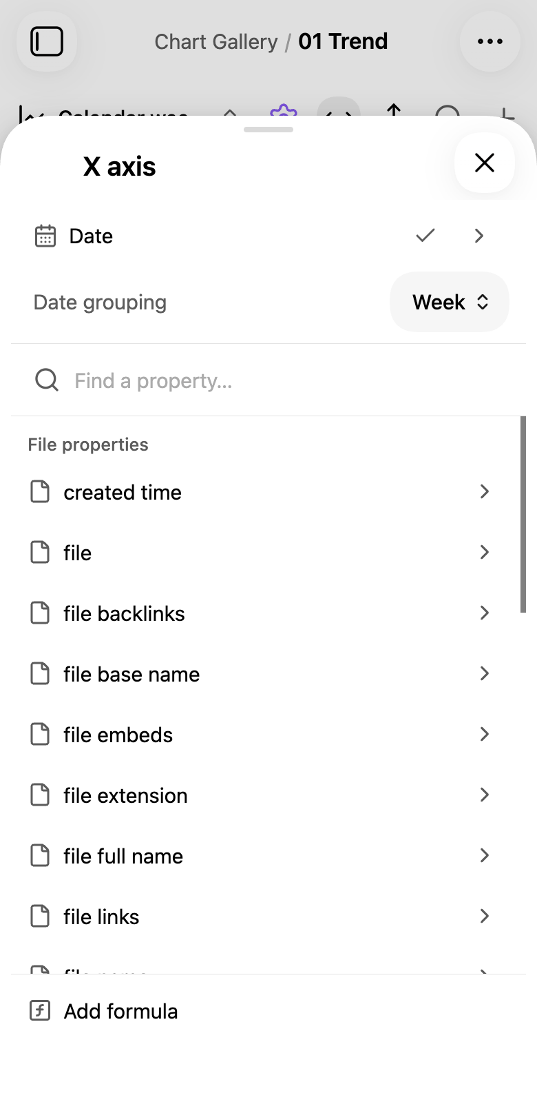
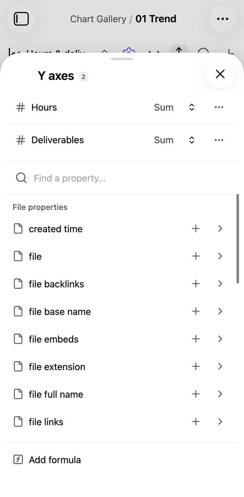
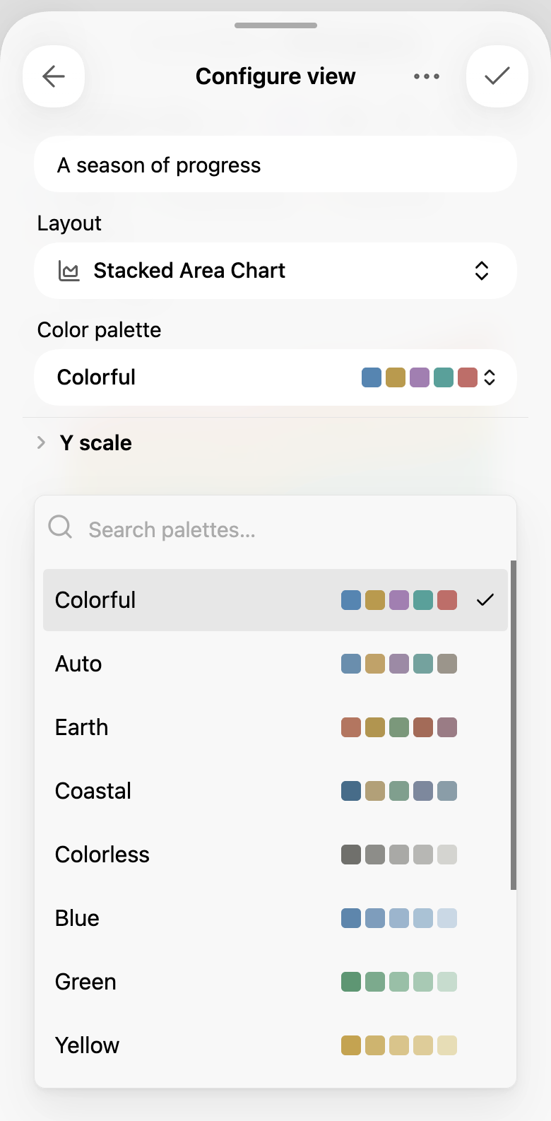
Axis settings use a native sheet. The palette picker shows the available colors for the current view.
Multiple measures and dark theme
Foldable phones and tablets
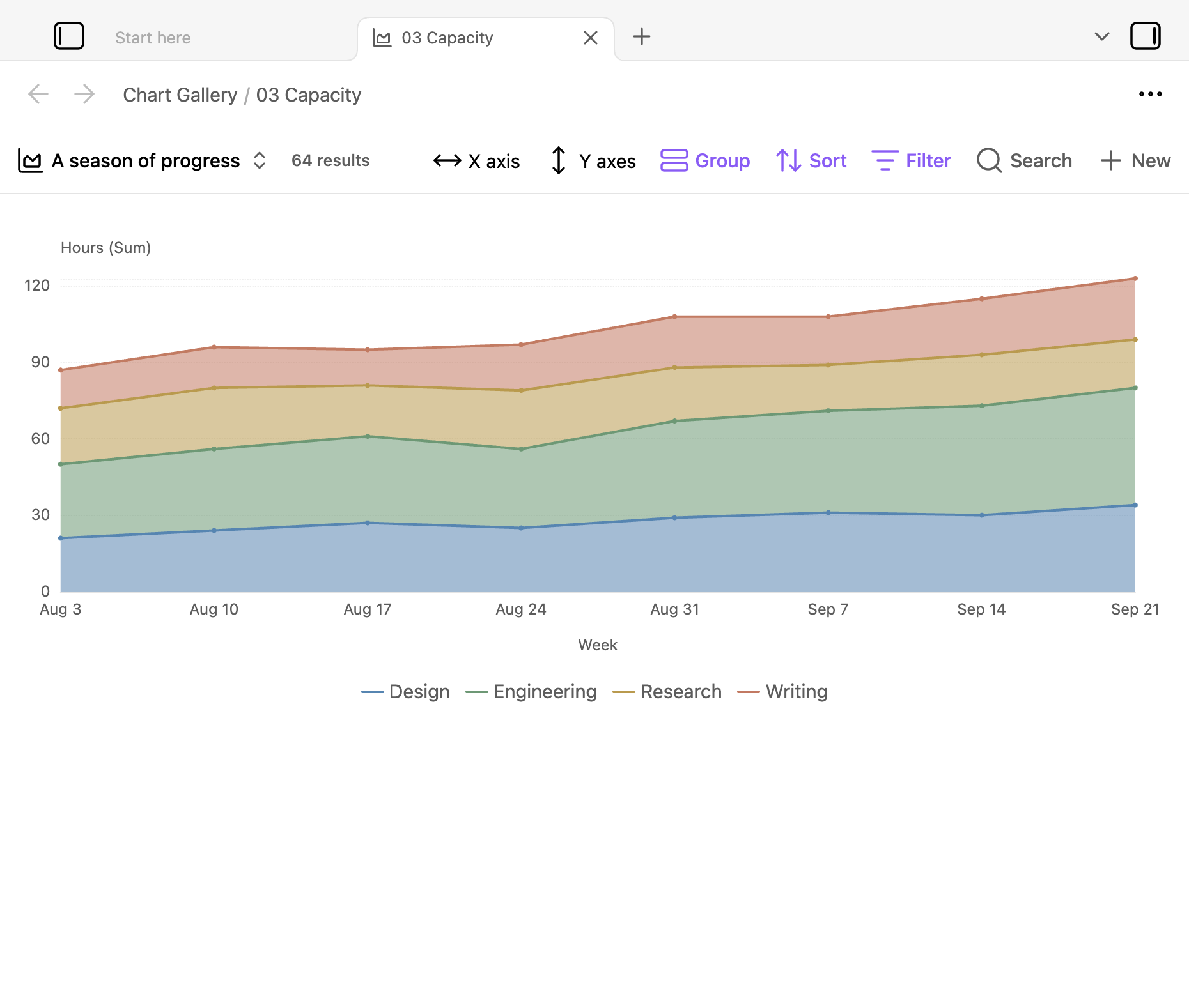
This capture shows a foldable-phone or tablet layout at 930 × 840 CSS pixels in landscape. Tooltips appear beside the selected column, without a bottom preview. The native interface remains visible.